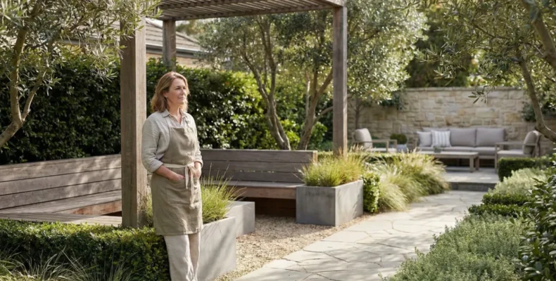
Light changes how surfaces look, shape guides how you move through the garden, and texture adds depth to certain areas. Together, they decide whether your outdoor space feels inviting, balanced, and easy to use.
Unfortunately, most people overlook these elements and focus only on plants and colours. But design goes much deeper than that.
Research shows that exposure to green spaces can reduce stress and lift your mood. When you apply light, shape, and outdoor texture thoughtfully, you amplify those benefits and create an area that truly works.
In this guide, we’ll walk you through how these elements work in outdoor design. Stay with us to see how it all comes together. By the end, you’ll know exactly what to tweak in your own outdoor area.
Light and Outdoor Texture: How They Set the Mood
Light changes how textures look and feel throughout the day. In the morning, shadows stretch across rough or smooth surfaces, which creates depth in places. By midday, sunlight sharpens every detail. The evening softens everything again.
This constant shift affects your garden’s vibe from hour to hour.
The following sections show you how to put texture to work.
Coarse Textures vs Fine Texture
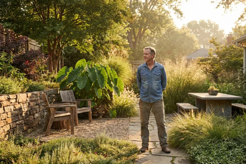
A rough stone wall grabs your attention, while fine grasses drift into the background. That’s coarse versus fine texture, and both shape how your garden looks and sits.
Coarse textures like stone, bark, or coarse-textured plants, including elephant ears and cycads, naturally draw the eye and feel bold in any garden. Now flip that around. Fine texture from ornamental grasses or small foliage creates a softer, calmer effect.
Once you understand both, the real benefit comes from combining them. That combination creates contrast and keeps the eye moving across your space.
How Plant Forms Add Visual Weight?
Plant forms add visual weight through leaf size, shape, and density. For example, a broad, bushy plant appears heavier than a thin, airy grass. That difference determines how balanced your garden will look.
To maintain this balance, foliage with large leaves anchors planting beds, while wispy plant forms feel lighter and work as fillers.
When you use both types together, the benefits are clear. One area won’t feel too crowded, visual weight spreads evenly, and your space flows better.
Using Texture to Define Spaces
Texture creates visual breaks through contrast. When surfaces shift from soft grass to rough stone, your eye picks up a boundary.
This visual boundary lets you define space. For instance, a border of coarse-textured plants or thick foliage separates different areas, like lounging spots from dining zones. Based on our observations, even a simple change in ground cover, from lawn to gravel or mulch to pavers, does the job.
However, separation alone isn’t enough. While contrast divides spaces, repetition helps to connect them. Using similar textures across the garden ties everything together and helps define spaces with a cohesive look.
How Curved, Straight, and Vertical Lines Shape Your Garden?
Lines shape everything in a garden. We’re claiming this because they control where the eye travels, the mood it creates, and its apparent size. That kind of impact sounds like a major project, but it’s not.
In fact, a few curved lines here or straight edges there can shift the whole feel of your outdoor area.
Let’s break down what each type brings to your garden.
What Curved Lines Bring to a Garden?
Curved lines bring a relaxed feel, softer edges, and the illusion of more space to your garden. Even small areas feel open and easy to move through.
Believe it or not, curves achieve all three by copying organic lines found in nature. Your eye follows them without effort and creates a calm feeling. Two features drive this by replacing harsh corners with soft bends and creating winding motion that makes spaces feel larger. That’s why curved pathways feel more inviting than straight ones.
Curved garden beds work the same way. They soften hard shapes near fences or walls and help the space feel connected.
Straight Lines and Vertical Lines for Structure
You get structure from straight lines that create clear edges, defined walkways, and visual order. Each direction works differently. Vertical lines draw the eye upward, while horizontal lines do the opposite, stretching spaces wider.
Patios and decks show these principles in action. In these spaces, vertical lines from tall structures or plants add height, while horizontal edging and walkways expand the perceived width. Together, they create the polished, formal look that suits structured outdoor areas.
Hardscape makes this easier to achieve because elements like paths, walls, and edging naturally follow straight lines. They connect architectural features of your house to the garden and reinforce that sense of order.
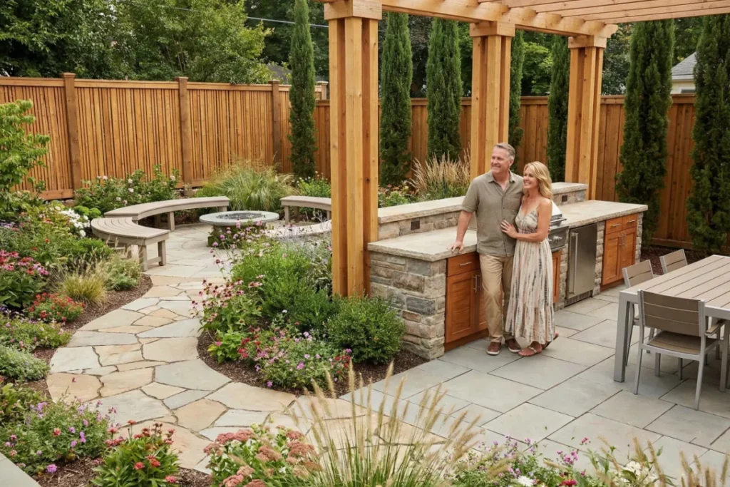
Mixing Line Styles in an Outdoor Kitchen
Mixing line styles in an outdoor kitchen balances function with comfort. That balance comes from straight lines handling work zones, curves easing transitions to relaxation areas, and vertical forms adding height.
Through our hands-on experience, we’ve found that this blend keeps the space from feeling too rigid. One reason is that tall features like pergola posts add structure without closing things off.
This mix makes your outdoor kitchen feel complete. You get organised work areas, smooth transitions, and a space that invites you to stay longer.
Why Every Garden Needs a Strong Focal Point?
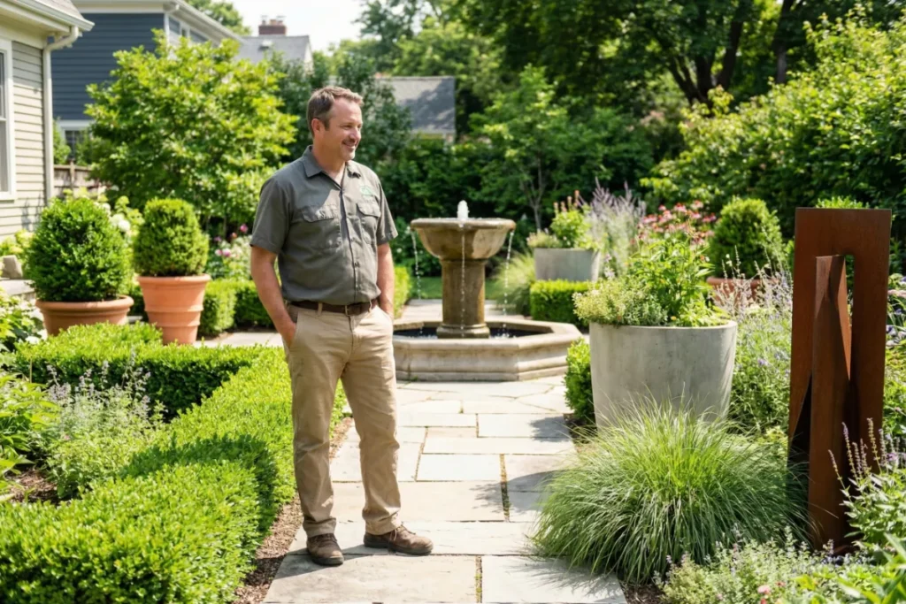
Every garden needs a strong focal point because it gives the space direction. It anchors the design, draws the eye, and makes the whole area feel intentional rather than scattered.
Without one, even a well-planted garden can feel off since balance, scale, and visual weight all depend on having a clear centre of attention.
Here’s how focal points and balance work in your favour.
Symmetrical Balance for a Classic Feel
Mirroring elements on both sides of a central focal point is what symmetrical balance does best, and it gives gardens that classic, refined feel. The approach echoes formal gardens where such balanced arrangements long signalled refinement.
Achieving it is straightforward. You only need matching plants, pots, or hedges flanking a path to create instant symmetry (a trick landscape designers have used for centuries). When you do this, visual weight stays equal, guiding the eye naturally. That structured precision makes it ideal for formal settings.
Even, it suits heritage homes with clean lines and predictable scale, which creates a polished, timeless garden.
Asymmetrical Balance for Modern Appeal
Asymmetrical balance creates modern appeal by breaking from rigid formality. Instead of mirroring both sides, it uses different elements with equal visual weight. This freedom suits contemporary gardens that favour organic, relaxed layouts.
The approach is simple yet effective. Rather than relying on identical forms, focus on balancing visual weight.
For example, a large pot on one side can be counterbalanced by smaller plants on the opposite side, while a tall sculpture can offset a low garden bed. Either way, the eye finds equilibrium without the need for exact duplication.
This flexible style works well in modern gardens and brings visual interest while staying approachable and unpretentious.
Picking the Right Focal Point for Your Space
Your focal point needs to match your space’s size and style. The right choice anchors your garden, while the wrong one feels misplaced.
That’s why you should match the scale to your space first. That means a large tree suits spacious gardens, while a sculpture or striking plant works in compact areas. Then place it where sightlines naturally lead, like a pathway’s end or garden centre. This positioning draws the eye exactly where you want it.
After placing your focal point, stop there. Because multiple focal points create competition for attention, they confuse the eye and weaken the design you’ve built.
Ready to Rethink Your Outdoor Space?
Many outdoor areas feel incomplete or disconnected without a clear direction. The problem often comes from not understanding how design elements work together. Small, intentional changes based on proven principles can solve this and create spaces that truly work.
This guide covered light and texture, line styles, and focal points. We explored how balance and visual weight anchor your design, and how to apply these principles in real outdoor spaces.
Bell Philips brings these design principles to life with expert outdoor living solutions. Ready to upgrade your space? Contact us today for a consultation.